Prompt Guide
The Grimoire: How to Write AI Sticker Prompts
Welcome, alchemist. The trick to a great sticker is simpler than it looks: describe the artwork you want — your subject, its style, your colors — and let us turn it into a clean, print-ready sticker. You never describe the sticker itself. This guide shows you exactly what to put in your spell, and what to happily leave out.
Spell Anatomy
What Makes a Good Sticker Prompt?
A good sticker prompt describes the artwork — your subject and how it’s drawn, the colors you want, and any text — in one or two vivid sentences. That’s the whole spell. The part that turns it into a real vinyl sticker is covered just below.
Think of it as describing your art to a friendly illustrator. Subject + style is your hero and how it looks (the heart of the spell — describe it richly). Colors is the palette you want. Text is any lettering, in quotes. No fourth slot for a background — there’s nothing for you to put there.
What Sticky Alchemy handles for you — so you don’t type it
- Sets a clean backdrop, then removes it — every sticker arrives as a transparent cut-out
- Adds breathing room around your design
- Leans into rich, vibrant color
- Keeps the art free of drop shadows
- Keeps the look illustrated, not photorealistic (unless you ask)
- Cuts and prints the kiss-cut vinyl sticker, and ships it
So you can leave these out of your prompt: “sticker”, “die-cut”, “white / transparent background”, “no background”, “negative space”, “no drop shadows”. A few (like “no background” or a drawn “white border”) can even backfire, painting an outline into your art that the cut then fights.
Pack the “subject + style” richly
This slot is the heart of your spell. Beginners write the subject and stop — a strong spell names a few more things:
- Subject — what it is + a key trait
- Art style — flat vector, kawaii, bold cartoon, pixel art
- Composition — one clear hero, a simple pose
- Mood — cozy, playful, fierce
Every detail you skip is a choice the AI makes for you — usually a generic one.
Three habits that do the heavy lifting
Describe a scene, not a tag list. “A sleepy red fox curled up with its tail over its nose” beats “fox, red, sleeping, cute.”
Say what you want, not what you don’t. “Bold, simple shapes” works better than “not too detailed.” The model tends to draw whatever you name, so naming it positively helps.
Keep one bold hero. A single clear subject reads beautifully at sticker size; a busy scene turns to mush.
See it come together
Here is a complete spell — a richly described subject, a palette, and short quoted text:
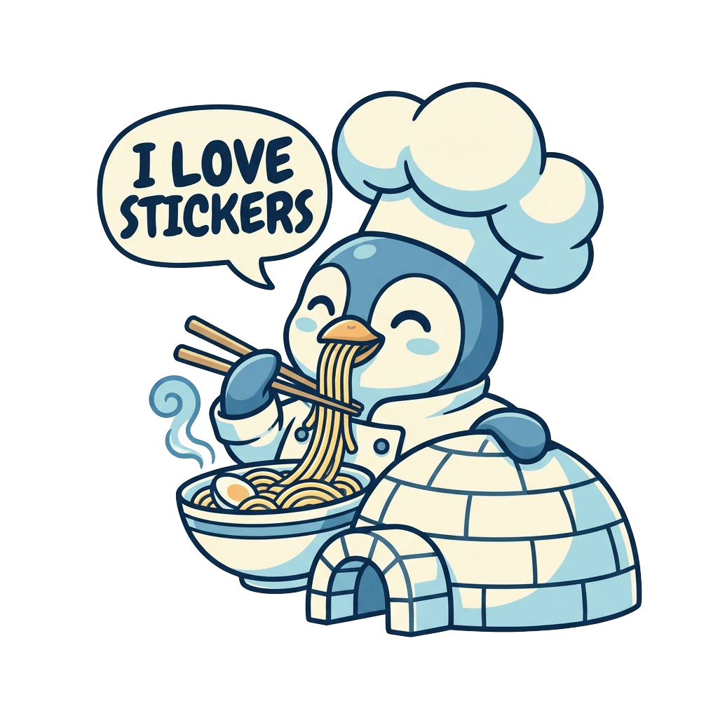
A cheerful penguin chef in an oversized white hat happily eating hot ramen with chopsticks in front of a small igloo, bold flat cartoon with thick clean outlines, in a cool blue-and-cream palette, with text "I love stickers" in a speech bubble
Notice it only describes the art — even the little igloo is just a scene the model draws in, not a background. That’s the real result on the right: copy the prompt to start your own from it, or Summon it to open it in Sticky Alchemy and make it yours.
More example spells to learn from
Each card shows a real result and the exact prompt that made it. Copy a prompt to start your own from it, or Summon the design to open it in Sticky Alchemy and tweak it. The last two show the only two defaults you can override — your palette, and asking for realism.
Keyword list → scene
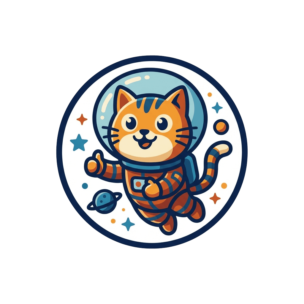
A flowing description beats “cat, astronaut, space, cute, helmet.” The model reads sentences far better than a pile of tags.
Example prompt
A cute cartoon cat astronaut floating happily inside a round glass helmet, giving a tiny thumbs-up, bold flat-outline cartoon style, in a rich blue-and-orange palette.
The fill-in-the-blank skeleton

The safest copy-paste: a [subject] with [traits], [art style], in a [palette]. That is the whole formula — subject + style, colors, and (optionally) text.
Example prompt
A sleepy red panda hugging a coffee mug, with chubby cheeks and a cozy half-lidded smile, bold clean outlines and simple flat cel-shading, in a warm autumn palette of rust, mustard, and cream.
An alchemist’s spell
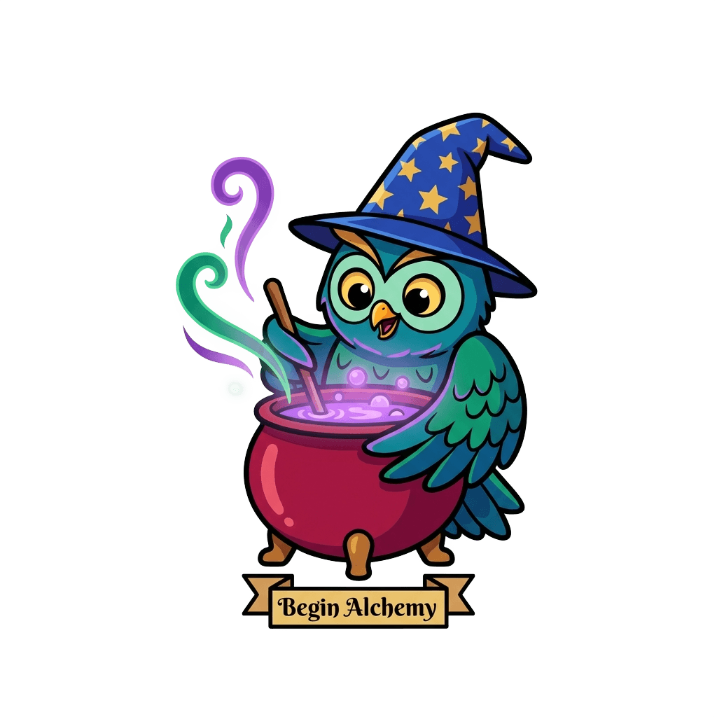
One hero subject, a glow that is part of the art, short quoted text. Reads as a story, not tag soup.
Example prompt
A cheerful owl wizard brewing a glowing purple potion in a bubbling cauldron, wearing a star-patterned pointed hat, bold flat illustration with thick outlines and a soft magical glow, rich jewel-tone colors, with text "Begin Alchemy" on a little banner.
Steer the color: name a palette
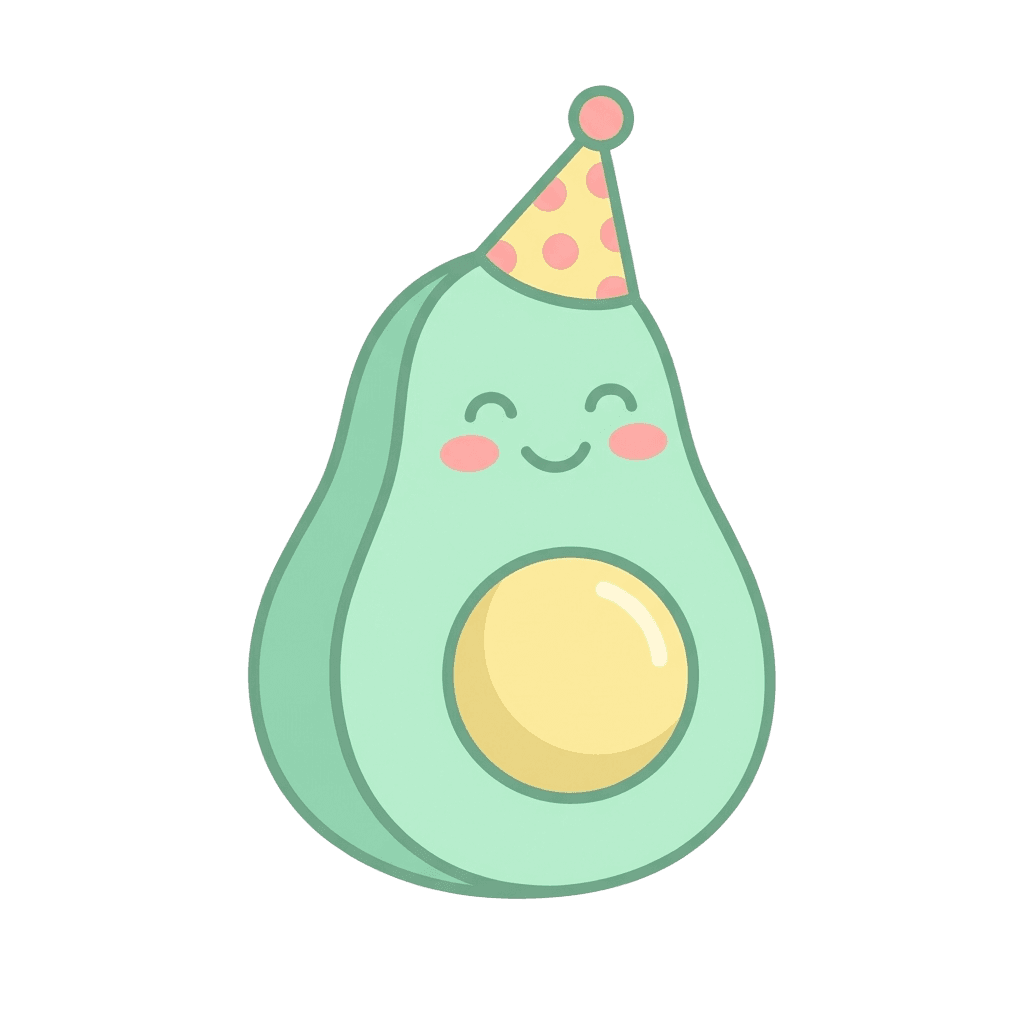
We lean toward rich, vibrant color by default — but the exact hues are yours. Name a palette and you’re steering it. (Colors describe the subject, never a backdrop.)
Example prompt
A smiling avocado in a tiny party hat, bold flat cartoon, in a soft pastel palette of mint green, butter yellow, and blush pink
Steer the realism: ask for it
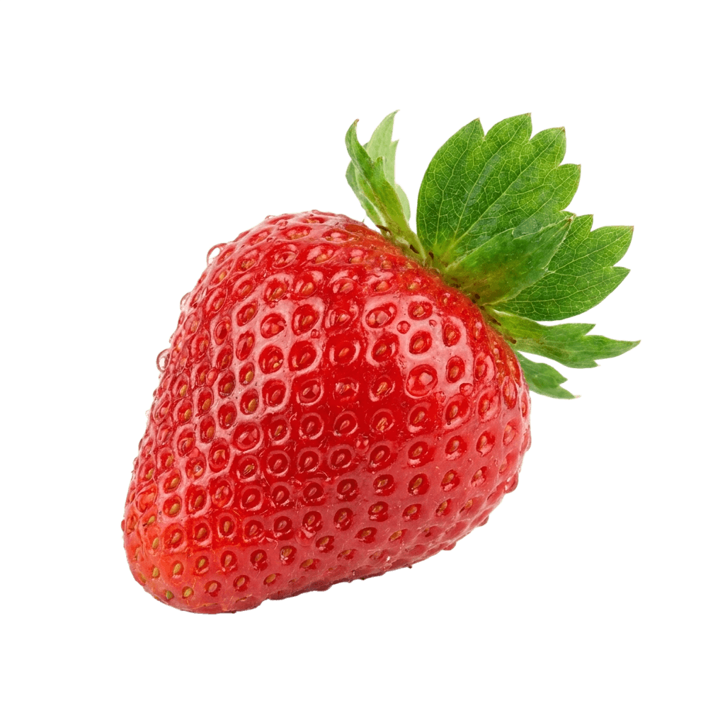
We lean illustrated by default because it prints cleaner small. Add “photorealistic” to override that — just know fine detail gets harder to read tiny.
Example prompt
A photorealistic ripe strawberry with glistening dewdrops and a bright green leaf, vivid red, crisp and high-contrast
Design Styles
Which Art Styles Work Best for Stickers?
A style word is the fastest way to transform a spell — name the look you want and weave it into your subject. Bold, flat styles (kawaii, flat vector, comic, pixel art) read beautifully even when a sticker is small. Softer, detailed styles like watercolor and fine single-line art are gorgeous too; they just need a little simplifying first.
A simple rule for legibility
Whatever style you pick, lean toward a thick clean outline, flat high-contrast color, and one clear subject — that’s what reads at arm’s length on a sticker.
Bold & flat — print beautifully tiny
Kawaii / Chibi
Prints great tiny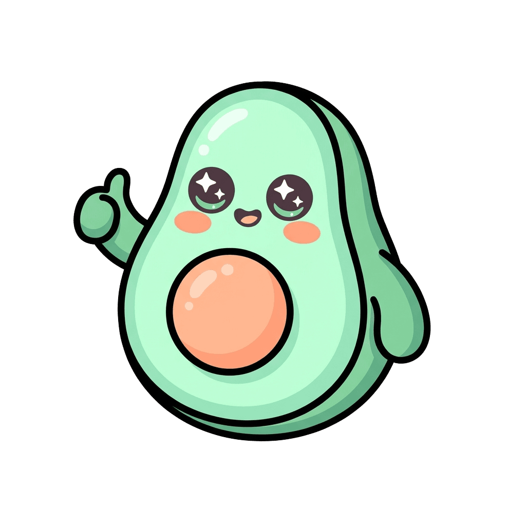
Cute big-head, small-body characters with sparkly eyes and a soft pastel palette. The reliable crowd-pleaser.
Style words to weave in
kawaii, chibi, big head small body, oversized sparkly eyes, rosy cheeks, thick rounded outlines, soft cel shading
Example prompt
A kawaii chibi avocado with big sparkly eyes and rosy cheeks giving a thumbs-up, thick rounded outlines and soft cel shading, in a pastel mint-and-peach palette
Flat Vector / Line Art
Prints great tiny
Clean 2D shapes with flat fills, or a pure outline drawing. Great for clean, scalable edges — just keep the line weight thick.
Style words to weave in
flat vector art, clean bold geometric shapes, solid fills; or monoline line art, single-color outline, thick even line weight
Example prompt
A flat-vector mountain range with a rising sun and one pine tree, bold clean lines and a simple two-color fill, in teal and warm orange
Pop Art / Comic / Halftone
Prints great tiny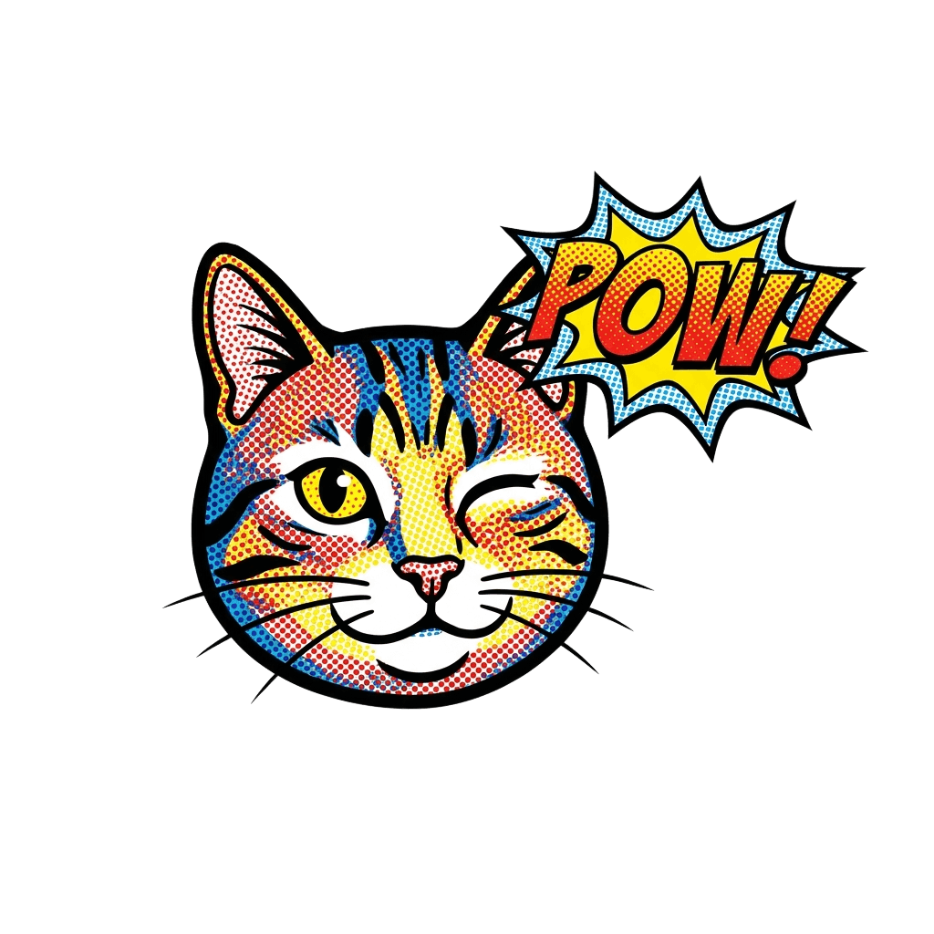
Bold comic art with heavy outlines, halftone dots, and punchy primaries. High-contrast by nature, so it loves being small.
Style words to weave in
pop art, comic book style, bold black outlines, halftone dots, cel shading, bright primary colors, action lines
Example prompt
A winking cat face in comic-book style, halftone shading and bold black outlines, in bright primary red, blue, and yellow, with text "POW!" in a speech bubble
Pixel Art
Prints great tiny
Blocky retro game art. Surprisingly print-safe because the pixels are already chunky.
Style words to weave in
pixel art, 8-bit, 16-bit, retro game sprite, blocky, limited retro palette, crisp pixel edges
Example prompt
An 8-bit pixel-art arcade joystick with a red ball top, blocky crisp edges, in a limited retro palette of magenta, cyan, and black
Retro / Vintage (70s, 90s, Y2K)
Prints well
Nostalgia keyed to a decade’s palette and motifs. Invoke via era + palette; keep heavy grain light so it stays crisp.
Style words to weave in
retro 70s / 90s cartoon / Y2K, era-specific palette, bold outline, slight grain
Example prompt
A retro 70s smiling sun with a groovy rainbow arc, bold outlines, in a muted palette of orange, mustard, and brown
Hand-Lettered / Typographic
Prints well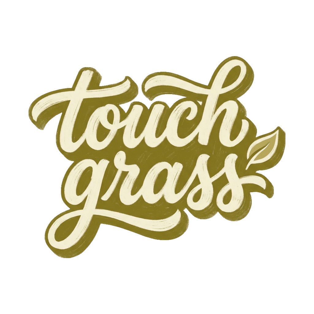
A word or quote as the hero. Demand bold, readable letterforms — thin cursive closes up when small.
Style words to weave in
bold brush lettering, custom display type, thick readable letters, decorative flourish
Example prompt
Bold brush-script lettering reading "touch grass" with a small leaf accent, in a warm retro palette of olive and cream
Woodcut / Linocut / Risograph
Prints well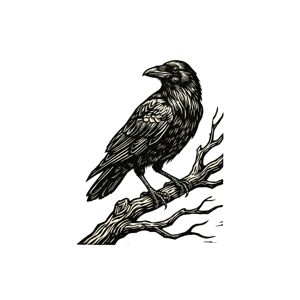
Handmade relief-print looks: carved bold lines, limited inks, a little grain. Bold blocks hold up well small.
Style words to weave in
linocut, woodblock print, bold carved lines, ink texture; or risograph, limited 2–3 color palette, grainy retro zine feel
Example prompt
A crow on a branch in linocut style, bold carved black lines and high contrast, a single ink color on warm cream
Holographic / Iridescent
Prints well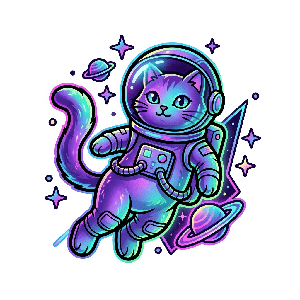
Shifting rainbow shimmer and neon gradients. A painted look, not a print finish (see the note below) — so treat it as a color choice.
Style words to weave in
iridescent rainbow shimmer, neon gradient, prismatic, chrome, holographic look
Example prompt
A space cat with iridescent rainbow-shimmer fur shifting from purple to teal, bold outlines, neon gradient glow
Gorgeous — but simplify for small print
Watercolor
Simplify for small print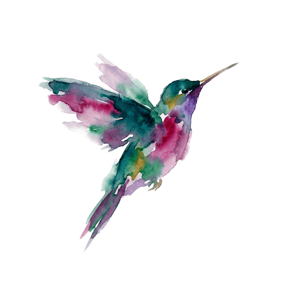
Soft, bleeding pigment and paper texture — beautiful, but the highest-risk look small. Steer toward a few bold washes.
Style words to weave in
loose watercolor, a few bold color washes, soft edges, painterly, minimal detail
Example prompt
A hummingbird in loose watercolor, a few bold color washes with soft edges and minimal detail, in jewel-tone teal and magenta
Minimalist / Single-Line
Simplify for small print
One continuous line, or a few essential shapes. Striking — but hairline strokes vanish when small, so demand a thick line.
Style words to weave in
single continuous line, one-line drawing, minimalist, a few essential shapes, BOLD thick line weight
Example prompt
A mountain and crescent moon as a single continuous line, one bold unbroken stroke with a thick line weight, in deep navy
3D / Claymation / Pixar-ish
Simplify for small print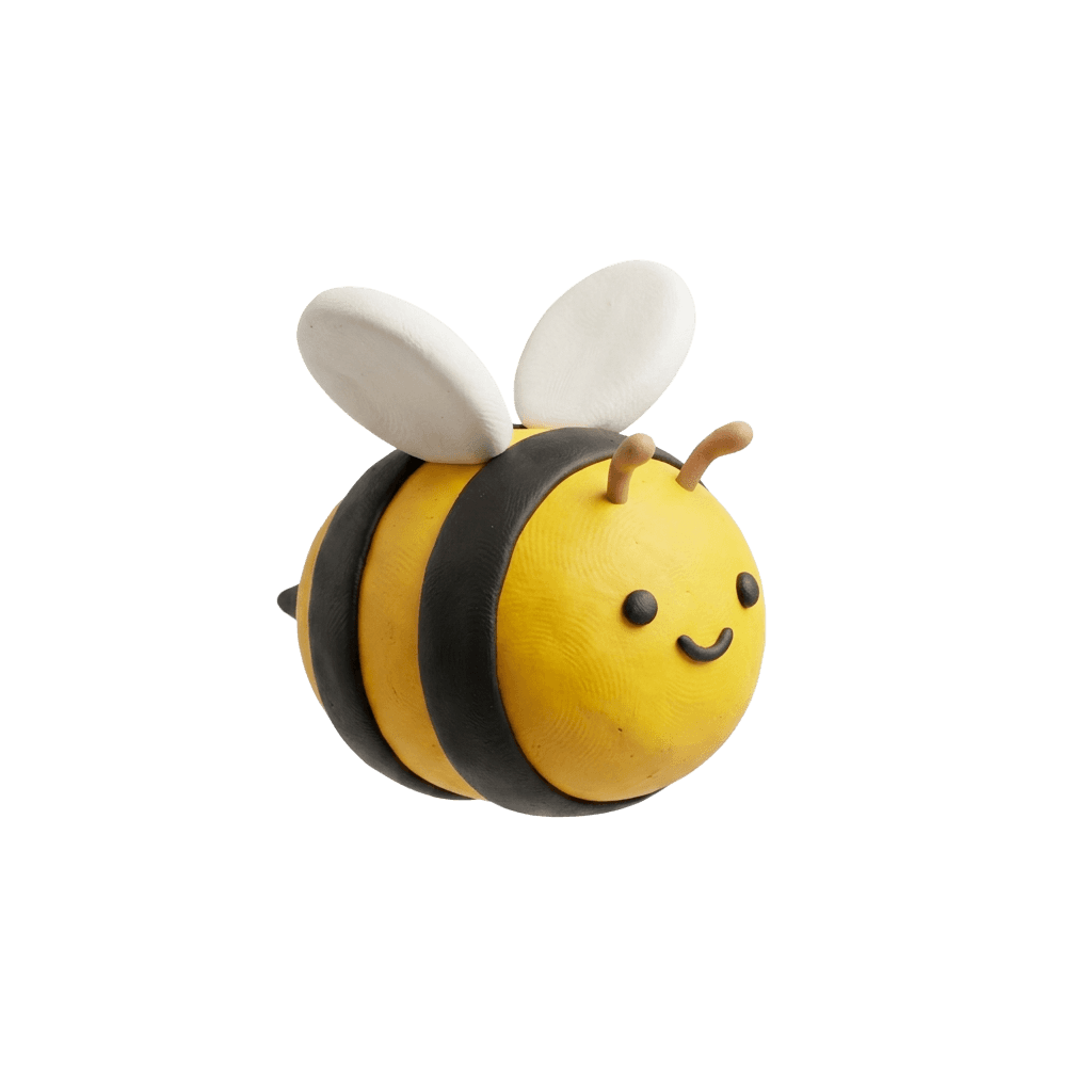
Soft rounded 3D characters with a clay or polished finish. Cute, but heavy shading muddies small — flatten toward bold shapes.
Style words to weave in
3D render, claymation, clay texture, rounded shapes, cute stylized, soft lighting, simple bold shapes
Example prompt
A cute claymation bumblebee with a rounded clay body and a tiny smile, soft lighting and simple bold shapes, in cheerful yellow and black
A note on holographic
“Holographic” and “iridescent” are eye-catching looks the AI can paint into your art — shifting rainbow shimmer, neon gradients. They’re a color/style choice, not a print finish: we print on standard premium vinyl, so describe the shimmer in the artwork (“iridescent rainbow shimmer, neon gradient”) and it shows up as art.
Iterating on Designs
How Do I Refine a Sticker?
Rarely is the first cast perfect — and that’s by design. Hit Refine on any result (or Remix any design in the public gallery) and describe a single change in plain words. Each refinement builds on the current result and costs 1 credit, so the craft is making focused, one-thing-at-a-time edits that protect everything you already love.
Refine like a conversation
One change per refine. Type a change (“make the mug blue”), see it, then type the next. It’s faster and more reliable than rewriting everything.
Say what stays, not just what changes. Add “keep everything else exactly the same” so a small edit doesn’t quietly redraw the whole design.
Make additions feel native. “Add round sunglasses — make them sit naturally and match the existing style” beats a bare “add sunglasses.”
Know when to start over
Each refine re-interprets the previous image, so tiny errors add up. After three or four edits, watch for drift, a greenish tint, or smudging creeping into untouched areas.
When a design has wandered far from your intent, don’t fight it one credit at a time — roll everything you learned into one rich new spell.
If a refine made things too busy for sticker size, push toward bolder, not finer: “bolder shapes, higher contrast, fewer elements.”
Too vague
“Make this sticker look better.”
Gives the model permission to change everything — a wasted credit.
Focused
“Change only the hat to blue. Keep everything else the same.”
Moves exactly one thing and protects the rest.
Targeted color swap
Names the one change AND everything to preserve, so the refine moves only what you intended.
Example prompt
Change only the chef’s hat from white to bright blue. Keep the penguin, the ramen bowl, the chopsticks, and the speech-bubble text exactly the same.
Add an element that fits
The “sit naturally, match the style” clause makes the new element look native instead of pasted on.
Example prompt
Add small round sunglasses on the penguin. Make them sit naturally and match the existing flat cartoon style and lighting. Keep everything else unchanged.
De-clutter for print
A clean, single subject reads far better at sticker size than a busy scene.
Example prompt
Simplify the scene — remove the igloo and extra props and leave just the penguin. Keep the penguin and text identical.
Using References
Can I Turn a Photo Into a Sticker?
Yes. When words aren’t enough — you want your dog, a specific art style, or an exact palette — attach up to three reference photos (JPEG, PNG or WebP, under 10MB each) and the AI fuses them with your spell. References are used once for that single generation and then discarded — never stored.
Pick the job before you upload
The same photo can do four different jobs — tell the AI which one:
- Likeness — “turn the dog in the photo into a character”
- Style — “in the artistic style of the attached image”
- Composition — keep an arrangement or pose
- Palette — “use the colors from the image”
A bare photo plus “make this” lets the model improvise — name the role and what to preserve.
Fewer, clearer photos win
One clear photo is usually enough. Add a second only if it brings something new — another angle, the palette, the style. Three is a ceiling, not a target.
A good reference is clear and uncluttered: fill the frame with the subject, use even light, skip blurry or far-away shots. The AI can only reproduce detail it can actually see.
Anchor first, then refine. Attach the photo on your first cast to lock the look, then drop the references and Refine conversationally. (You can’t re-refine a reference — it’s used once.)
Pet photo → character (likeness)
Names the subject, states what to preserve, and asks for the art style. The result is a stylized homage, not a literal copy.
Example prompt
Turn the dog in the photo into a cute kawaii character with thick rounded outlines and a rich color palette. Keep its fur color and floppy ears recognizable.
Borrow a style
The subject comes from your words; the look comes from the reference. Tell the model which to take from where.
Example prompt
A red fox curled up asleep, drawn in the artistic style of the attached image, bold high-contrast shapes.
Match a palette only
Separates the jobs: subject from text, colors from the photo. Great for matching a mood without copying the photo.
Example prompt
A smiling avocado character wearing a tiny hat, bold flat cartoon style. Use the color palette from the attached image.
A quick word on rights
Only upload photos you have the right to use. They shouldn’t contain other people’s likeness or trademark-exact copyrighted characters — stylistic homages are welcome. References are content-moderated, and likeness is approximate and stylized by design, so nail the key details in words and let Refine handle the rest. See our Terms for the details.
Frequently Asked Questions
Should I write my prompt as a sentence or a list of keywords?
Do I need to put "white background", "transparent", or "die-cut" in my prompt?
Can I ask for a solid-color background behind my subject?
How do I pick colors for my sticker?
How do I get readable text on my sticker?
Can I turn a photo of my pet into a sticker?
Why do bold, flat styles look better than photorealistic ones?
When should I refine a design versus start over?
You’re ready
Cast your first spell
New accounts start with 5 free design credits — no card needed. Describe your idea, refine it until it shines, and we’ll print the real vinyl and ship it to your door.